Showing posts with label graphics. Show all posts

Monday, November 27, 2017

"Pause" t-shirts redux

It's the design that keep on giving!  The t-shirt design I co-created for a youth ministry Disciple Now event back in 2011 and was re-used by another ministry in 2012 seems to have a life of its own.

Back in September of this year, I was approached online by John Copeland, a youth pastor from Georgia, who had stumbled across the blog post I wrote about those "Pause" t-shirts.  As it turns out, his youth group was in need of a similar event tee, so he reached out to request permission to use the design.  As I've demonstrated before, this is perfectly acceptable (and appreciated) request to make!  So, naturally, I was happy to see the design used yet again by someone else.

When it was all said and done, I was even able to connect John with the fine folks at Contagious Graphics, who still had the design artwork on file from the first time they printed up the shirts.  All I asked in return from John was that he send me a photo of his youth group wearing the shirts, and I was so pleased this morning to see that he had made good on his promise!


Tuesday, August 20, 2013

2013 Dominican Republic Missions Trip Shirt Design

A couple of months ago, I was asked to design a trip T-shirt for my church's Dominican Republic mission trip. I was happy to help. There was only one problem: with only a couple of days before my deadline, no one could tell me anything about the trip or its theme!

Eventually, I was given a verse to work with — Colossians 1:16.
For in him all things were created: things in heaven and on earth, visible and invisible, whether thrones or powers or rulers or authorities; all things have been created through him and for him.
And I was told that the primary ministry work on the trip would be to teenagers hungry for apologetics.

Here's what I came up with for the main graphic, which was on the back of the shirt:
The idea here was to take the whole world, give the land masses a bit of texture and height, but highlight the Dominican Republic with some landmarks and commonly found palm trees.  But how to credit God with His creation? Then, I recalled a phrase I heard (or misheard, or misremembered, or...) long ago about "putting one's thumbprint on" something — that is, leaving your signature on something you've done.  From there, I had the idea to embed the Tetragrammaton into the thumbprint itself, clearing up any question about Whose mark it was that was left.

I used a simple event marker for the front-left chest print:
Which brought the whole thing together like so:

Monday, October 15, 2012

Logos "in the wild" ... still weird to me

I still can't get used to seeing my Harrisburg Parks and Recreation soccer logos "in the wild". What began as a simple logo for my son's soccer team a few years ago grew into the opportunity to do logos for the big kids, too, and then evolved (with the assistance of at-that-time coordinator David Karpey) into the chance to design official logos for the Harrisburg Parks and Recreation sports programs.

Naturally, I started with soccer (as a fork of the adult league design I'd already done):

... then continued with baseball:

... and softball:

I never got around to finishing the flag football and basketball designs, and to be honest I haven't even noticed if the baseball and software designs ever got used. But it's kinda cool to see the two-color version of the soccer logo all over my town every Saturday of the Spring and Fall.

If anything, it's a great reminder of the many benefits of living in a smaller town, where unexceptional guys like myself can have opportunities of this sort to do something for the community simply for the love of it all: the love of a gracious God who bestows talent and desires that we serve Him and each other with it, the love of art, the love of the sport (and by "the sport" I mean, of course, soccer), and the love of the Harrisburg community.


Friday, September 21, 2012

Black Ninjas and White Tigers

This soccer season, my sons wound up on teams with opposing color schemes. My youngest son, Aidan, is a member of the White Tigers, who naturally have white jerseys with black highlights. Gavin, on the other hand, plays for the Black Ninjas and sports a black jersey with white highlights.

As in seasons past, I was interested in designing logos for the teams. And as in seasons past, I was motivated to actually do so and to get iron-on patches made up from the designs by my friend and fellow coach Wynee Bullerdick. Wynee and I have never coached together, but her son was a part of the Soccer Monsters team many seasons ago from which have launched several different coaches, teams ... and logo-lovers! So as in seasons past, Wynee offered to help fund the patch order in exchange for a share of the booty, patches she could distribute to her own similarly named teams in different age-bracketed leagues.

I did the Black Ninjas logo first. The whole black/white thing took me quickly to the Yin and Yang symbol. I wrestled a bit with using the symbol due to its connection with eastern religions, but the general concepts of balance in life and creation seemed universal enough. Besides, given that I was designing a logo for "ninja warriors", a graphic that was suitable for, say, Christian worship services was already out of reach. In the end, I offered only an incomplete yin-yang symbol.

The White Tigers design was much more difficult for me, just in terms of how tedious the work was. As I've mentioned before, I'm a total amateur at this stuff, using (or abusing?) amateur tools. No tablets with stylus input devices here. Those curves are all painfully hand-manipulated in a vector drawing application.

One thing I did this season differently than in previous ones was to avoid putting the team name in the design. I wanted to design something that was flexible enough to be reused by someone else in the future who might have a different team name altogether. This will likely be the approach I take from now on for these un-commissioned works.

If you're reading this and you have a team whose name fits, I'll be happy to sell you some of my leftover iron-on patches made from these designs! Email me at cmpilato@red-bean.com.

Tuesday, July 17, 2012

Phillie-area mission trip t-shirt

The ink had barely dried on my church youth group's recent lock-in t-shirts when the new Minister to Students, Trey Reid, was feeling out my interest in designing a shirt for a mission trip to the Philadelphia area. I love doing this stuff, so how could I resist?
When I think of Phillie, I think of war, revolution, liberty, freedom, etc. — you know, grade-school social studies material. From there it's but a teeny tiny cognitive step to themes revolving around the freedom that Christ offers to the believer. So that's where we went. Trey chose John 8:32 for the key verse:
Then you will know the truth, and the truth will set you free.
In terms of design constraints, Trey merely asked that the shirt be bright and absolutely not red, white, or navy blue (since it would be worn by the group as they toured Washington, DC).
As is common, I dragged my wife, Amy, into the process. We talked about various things and then independently toyed with some ideas. She was really big on the idea of using a postmark to get "Philadelphia" into the design; I was mostly thinking of ways to work a major landmark — say, the Liberty Bell — into it while incorporating the verse. When I combined our ideas, I was extremely pleased with the result:
As always, the original artwork is vector-based, infinitely scalable without quality degradation. And as always, if there happens to be someone out there who wants to recycle this design for some reason (hey, I wouldn't have believed it either were it not for prior experience), that's perfectly okay with me.
Here are some close-ups of the graphics:
My favorite subtlety is the way the postmark's curvy line calls to mind images of the U.S. flag, sitting right there behind the word "free". I wanted to ensure that "truth" and "free" were emphasized words, and took advantage of the common use of the plus sign (that is, a cross) as a conjuction. In a last-minute decision, I also inverted the Philadelphia skyline silhouette on the shirt back ("turning Phillie upside-down for Jesus!").
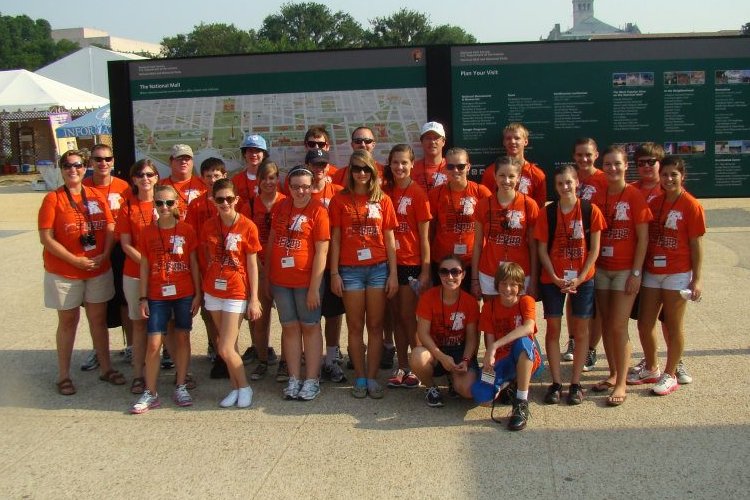
Feedback on the shirt has been positive, and Trey was kind enough to let Amy and I each one.  Here's a photo of the youth mission team wearing theirs:
(For those wondering, yes, I'm keenly aware of how dangerously close this shirt design comes to muddling religious and patriotic themes. In this instance, I accept that risk as a useful conversation starter.)

Sunday, June 17, 2012

Soccer Rockets, and the joining of the two sons

This past youth soccer season was a unique one for our family because Gavin and Aidan's ages aligned such that both of them could be on the same team. There are obvious practical benefits to this as a parent: you have half as many practices and matches to attend, infinitely fewer schedule conflicts to deal with, and only one team patch to design (if you're like me and simply can't make yourself stop doing that):


Fortunately, the benefits weren't limited to solely the practical ones. The Soccer Rockets (as the team was called) was a great group of kids from highly varied soccer backgrounds. It's pretty normal for coaches' kids to bring a good deal of experience to the field, and this was certainly the case for my boys and my assistant coach's son. Offsetting this were several players who'd never played the sport before, each bringing different levels of general athleticism, "coachability", natural hustle and aggression, etc. to the field. It was great to see all the players growing in their individual skill levels over the course of the season. But as I think back on the Soccer Rocket season (which, by the stats, was a pretty mediocre one), I'm thrilled by the evidence of the early stages of true team play.

At this age level, I'm pretty happy if I can get the players to pass the ball much at all. There's still such a tendency to want to keep the ball until it is taken off your feet, and to a point, that's no bad thing. As a coach, I want to tread carefully when instructing so that passing is understood as an advantageous and intentional offensive tactic, not just something you do when you're too scared to hold onto the ball yourself. Fortunately, several of the players "got it" and were starting to work in pairs and threesomes to move the ball around the field together. More surprising to me was that these young players (and these are kids under nine years old, mind you) were also beginning to openly communicate with each other on the field -- giving helpful direction to each other on set pieces and throw-ins, calling for passes, and so on.

So once again, another season gets filed in the history books, and we look forward to enjoying the summer break before doing it all over again in the fall, when Gavin will age up into the U11 (boys-only) league, and we'll be back to two practices and two games per week as a family. The single-team thing was definitely good while it lasted!

Monday, May 7, 2012

"Radical" t-shirts

I recently was asked to create another T-shirt design for my church's youth group's Disciple Now event. The event was ultimately downsized from a full-blown D-Now to a single-night lock-in, but as this was the first major event hosted under a new Minister to Students, we wanted to go "big" (or bigger, at least), so we sprung for the T-shirts anyway.

The theme was to be "Radical: Putting God First", with Deuteronomy 6:5 as the theme verse.

Love the Lord your God with all your heart and with all your soul and with all your strength.

I started as I always do: hand-drawn sketches, word maps, etc. The idea of swimming upstream (counter-culture, radical, etc.) appealed to me, especially given the symbolic connection between Christianity and fish. And I was searching for an iconic way to represent the "heart", "soul", and "strength" words. Here are some photos of those initial fiddlings:

I ended up not caring much for the winner's stage treatment of the three icons for the shirt back, so I just simplified those into three rounded icons, with a stylistic approach to the verse quote. (In fact, I got said stylistic approach from the way that block quotes are rendered by this very blog's templates!)

The front of the shirt came together pretty much like the sketch, except that I revisited the heart/soul/strength icons as watermarks, and added some grungy text:

Finally, here's the concept image I put together to "sell" the design to our pastor and youth leadership:

If you're looking for a shirt design along a similar vein and wish to recycle this one, I am, to put it rather concisely, quite okay with that. Just ask me via email for the artwork files.


Thursday, March 8, 2012

"Pause" t-shirts, revisited ... by someone else!

A few months ago, I got an unexpected email from a lady named April Buse:

Hello,

We are from a church in South Dakota that puts on an annual winter retreat, much like the one you mentioned in your blog. It just so happens that the theme we chose this year is "pause." As we were googling images for our t-shirt designs, we saw your t-shirt design and LOVE the design, especially the glow in the dark GOD. We were wondering if you would mind if we used your creative design for our retreat t-shirts this year. So that we don't steal your original design, we would be willing to tweak it a little bit. Please let us know your thoughts as soon as possible as our winter retreat is in mid February. Thank you and God bless!

To say that I was surprised would be quite an understatement. I am both honored and bewildered that some random person would stumble across a graphic design via my blog (you can see the post yourself at http://cmpilato.blogspot.com/2011/03/disciplenow-2011.html) and want to use the artwork. I mean, when I wrote that post, some part of me was thinking, "Hey, this idea seemed to work out well for us, and maybe somebody else will be inspired by it, too." But did I think that would really happen? Not hardly. I'm fairly certain that my blog readership peaks out at, like, three people. And I'm one of them.

After the wave of amazement and gratitude passed over, I confess I had less pleasant thoughts:

  • April was asking permission to reuse the design. That's great, and polite, I suppose. But why was it necessary? Because we live in a culture where reuse, remixing, and recycling of ideas has become a bad thing that must be policed.
  • She actually used the word "steal", as if her printing t-shirts would suddenly cause my own to disappear, the artwork files to be deleted from my computers, and the screens at the shirt printers' warehouse to turn to dust. I don't fault her for this — rather, I fault the loud voices in our culture that would have us to believe that copying is theft. (Psssst... it's not.)
  • She used the term "original design". Now, nearly anybody would have used the same term. But what is originality? Is not every single thing of man's making just a remix of what can be found in nature already? Just a new spin on what God has already designed?

Fortunately, my grumpiness passed quickly and I was able to return back to amazement and gratitude. "Sure you can use the design," I replied, and even sent April my original artwork files. This was beneficial, as it turns out that some changes to the artwork were necessary to accommodate the specific design elements that her group needed for their shirts. I provided all the help I could, wished her luck, and that was that. Time passed and I eventually forgot about the exchange altogether.

Well, I heard back from April the other day. She mailed to say that the shirts were a hit, and even sent me a photo of her group wearing them:

The kids in the group even chose a day to wear the shirts to school as a way to generate buzz and maybe kickstart conversations with friends about the shirt's meaning and the Gospel message. How cool is that?!

If you are a generator of creative works — especially someone who might be inclined to credit God for your talent or claim to produce those works for His service — I beg you to consider the negative impact of restrictive licensing of those works. I beg you to understand that a copied idea only makes it bigger, makes it more impactful, makes it more influential; it doesn't take anything away from the "original". And finally, I beg you shoot straight with your consumers: if you do what you do merely to cash a royalty check, please don't call that an act of worship.

Friday, September 9, 2011

Kickin' Pandas

Another season of soccer is upon us. Another batch of eager young athletes. Another few months of practices, matches, and all the hard work of preparing for both. And... another logo!

This year, my youngest son's team has black and white jerseys. Because of the recent popularity of the so-titled film around my house, we started off with the name "Kung Fu Pandas". But the re-use of a trademarked name was uncreative. So after consultation with my assistant coach, we rechristened the team as the Kickin' Pandas. (We did, however, keep the "1 ... 2 ... 3 ... skidoosh!" post-game chant!)

As usual, I started with a hand-drawn sketch. (The restaurant whose paper tablecloths I used to use for this task is now closed, so I had to settle for a sheet of notepad paper.)

From there, I went to work on the digitization step, using OpenOffice Draw as usual because I'm too much of an amateur and cheapskate to go with industry standard tools.

Then, an unexpected blessing: a fellow coach and friend in a different age bracket happened to choose the same name for her team, and was interested in getting iron-on patches made up, too. With her sharing the cost of the patches, the economics of the whole thing was no longer ridiculous. So we ordered the patches, which arrived today!

Thanks (yet again) to the folks at TJM (aka patches4less.com) for the great patch creation work!

Friday, June 3, 2011

Happy birthday, Gavin, from an old geek to a new one

My oldest son, Gavin, loves science and technology. His love is not just at a "video games are cool" or "I want an iPod because everyone else has one" level. It's much deeper, almost like just needing to know how the world works — by what rules does the Universe play, and how can we use our creativity to bend them? While his overactive imagination can sometimes be a source of conflict in the home (or in the restaurant, or church, or public restroom, or …), his mother and I do recognize the beauty of it.

Gavin turns eight years old in … well, in about two hours from now, technically. I was trying to think of something special I could do for him, when it occurred to me to use one of his favorite toys/tools — Lego® blocks — to create a portrait of him. At a design level, this isn't really so challenging. I mean, it only took moments to load up a recent photo of him into the GIMP, shrink it, posterize it, replace its palette with one based around primary colors, etc.

The result was a blocky image with Lego-ish colors whose aspect ratio had been adjusted to account for the fact that a 1x1 Lego block isn't square, but instead roughly 3:4:

No, the difficult part was in actually building the thing! Okay, not difficult so much as tedious. And of course, I failed to inventory my available blocks before starting, so it was on a wing and a prayer that the hours-long activity began. But in the end, every piece planned was in place (minus some black shadow blocks on the bottom I decided to omit), and the work was complete. I had a roughly 14" x 18" image of my son, made out of plastic, to present to him tomorrow as a surprise.

Monday, May 2, 2011

Soccer logos for the big kids

In the past several months, I've been given the opportunity to whip up another pair of logos for area soccer folk.

The first was for the adult football club-in-the-large in my town (Harrisburg, NC, USA). I was tasked with putting something together that was stylistically similar to the logo for the popular Premiere League team Arsenal, but with green and gold colors. Originally, I was asked to incorporate a train image into the design (symbolic of our town's history as a stop along an old railroad route), but that didn't work out too well. I was able to salvage from those efforts the shield backdrop, but decided to replace the train with the somewhat-popular player-in-action silhouette (modeled after some stock photo shots of real players doing cool stuff). The result was accepted by those who commissioned it:

You might wonder about the white star on the design. As it turns out, Cabarrus County (in which Harrisburg sits) is roughly triangular in shape. So I added the star to represent Harrisburg's general location in that triangle, using the "swoosh" of the ball and the shield edges to form the triangle itself in the logo. Oooh... mysterious...

The second logo was for the adult soccer team I play on, the Orange Crush. I really had no ideas on where to take this one, so the team captain whipped out some rough sketches of what he had in mind when he asked for the design:

I implemented the ideas, with some minor modifications, and we were good to go:

It simply wouldn't do to not thank Israel Curiel, Rachael Curiel, and David Karpey for their creative input into these designs. So, thanks, guys!

Tuesday, March 22, 2011

DiscipleNow 2011

This past weekend, our church (Providence Baptist Church) hosted DiscipleNow, the Youth Ministry's annual "retreat you don't leave town for", and the biggest event in their calendar. Each year, a bunch of teenagers get divvied up by gender and age and spend the weekend sleeping in host homes (typically, the homes of other church members), sharing in small group studies with college leaders, and then worshiping all together back in the church's youth building. There's a guest speaker, a guest worship band, member-provided meals — everything you'd expect from a youth retreat, minus the long drive in a cramped van that smells like teenagers.

Like last year, I was asked to help design event T-shirts. I met with Minister to Students Paul Batson over hamburgers to brainstorm ideas. The theme for the event was to be "Pause", covering how life can get so busy with all the activities that consume our days and nights that often we fail to notice and acknowledge God. Sometimes, we just need to pause a bit and focus on the Eternal rather than merely on the immediate.

Now, I'm big on the idea of making shirts that are conversation points. In my experience, you don't get much conversation by wearing a giant "I'm a Christian" banner across your back. Oh, people will be talking, all right, but just about you, not so much to you. Still, we wanted to include something in the shirt that illustrated not just the noise of life and need to pause, but also the "punchline" of the event's theme. Paul brought to the table the idea of using the universal pause symbol — two side-by-side vertical bars — with perhaps some words scattered around them to represent those distracting activities. And we had a stylized text "Pause" logo to work with, provided by the publishers of the study. But we were still trying to find a way to make the God connection in the design.

Then, inspiration hit. I was thinking about slowing down, pausing, relaxing, growing silent, blocking out noise … these things led me to picture turning off the lights and just enjoying the stillness of a perfect night. And in that stillness, that's where we see God. And that was the a-ha moment! See, I use Contagious Graphics for my screen printing, and every October they start pushing their glow-in-the-dark ink. I'd never used that ink for a shirt project before, but here was the perfect chance to do so. What if we could design a shirt that showed God — literally — when the lights were off?

The result was a design printed on cardinal red shirts, with a constant stream of "distraction words" broken up only so that the negative space could reveal the pause symbol:

But what you don't see in the light is that certain of the letters of those "distraction words" are printed with glow-in-the-dark ink, so that when the lights go out, God is revealed:

The final product turned out great! And better yet, Paul didn't tell the teenagers that the shirt had this feature until Sunday morning when many of them were standing at the front of the church serving as an adhoc choir. It was fun to watch the wave of surprise wash over them when this little detail was revealed!

Here are some photos (taken by Chuck Shoupe) of folks wearing the shirts on DiscipleNow 2011 Sunday:


Adhoc Youth choir


Amy sings out, with Carson on the bass (Paul's the bald fellow on the right)


Mike and Nick play guitar

NOTE: The stylized "PAUSE" text in the shirt design was modeled after the logo of the Orange XP3 "Pause" curriculum used for the event, with permission (obtained by Paul) from the publishers. Thanks, Orange!

Thursday, August 26, 2010

Shooting Stars

Youth soccer season is here again, and my youngest son couldn't be happier. His team (and seventeen others in his age bracket!) will take the field this Saturday as the first matches of the Harrisburg Parks and Recreation Fall 2010 Youth Soccer season take place. Okay, I confess — I'm pretty excited, too. This is my first season as a head coach in this age bracket, but I've assisted at this level for two years now. I easily have as much fun as the kids do!

This season, our team chose the name "Shooting Stars" (which was actually suggested by my wife), and as has become the routine, I managed to squirrel away 30 seconds to whip up a general logo design (once again composed on the table cover at Supper Restaurant) and then a couple of hours of digitization time.

Here's the final Shooting Stars Soccer Club logo:

… and the sketch that served as its humble roots:

UPDATE 9/7/2010: My patch order is in. Once again, the fine folks at Team Jedi Marketing have done a great job with the order:

Friday, April 16, 2010

Hot Lava

I caved. I couldn't take the pressure. In a moment of Crayola insanity — an opportunity once again afforded by the wait for delicious food at Supper — I submitted to forces beyond my control and scratched out a logo design for my son's soccer team, the Hot Lava:

I snapped the above photo with my not-so-featureful-or-powerful camera phone and emailed it to myself on the spot. Later, I took the image and used it as a template to work up a vector graphic representation of the logo idea. This was a much less complicated bit of work than the Flaming Dragons logo I recently did, but that's okay — these are 5- and 6-year-old kids.

Here's the final work:

The team's head coach seems to like it, at least if I'm correctly interpreting "DUUUUUDE!!! THAT ROCKS!!!!! I LOVE IT!!!!!". So I guess it's a "go". I really enjoy doing these simple little projects. The smiles on the kids faces easily justifies the minimal cost I put into creating the logos.

Wednesday, March 17, 2010

Flaming Dragons

Another season of youth soccer is upon us. Gavin's decided to take up piano this season, but Aidan is happy to have moved up to Harrisburg Parks and Recreation's 5/6 age bracket, the first in which the kids get to play actual soccer games.

The two guys I coached with last season on Gavin's team — Darryl Strack and Bobbie Middleton — have moved up with their kids to the 7/8 age bracket and are coaching together again. I ran into them last weekend, where I learned that their team had chosen the name "Flaming Dragons". I had a lot of fun with these guys last Fall with our Soccer Monsters team, including designing a team logo which we had made up into stickers and iron-on patches. So when Bobbie asked me last Saturday if I'd be willing to do the same for their new Flaming Dragons team, how could I pass that up? When eating lunch later day, I scratched out a rough idea in crayon (on the table top at Supper Restaurant) for the logo:

Then, I spent a few evening hours this week converting that simple drawing into a real vector artwork file:

Meanwhile, Aidan's team has chosen the name "Hot Lava". Not … really … sure what to do about that one just yet.

Monday, November 30, 2009

Subversion background (leather w/ punched holes ala Betts)

When preparing my presentation for this year's SubConf conference, I was looking for a background that wasn't so … run-of-the-mill. I stumbled upon a post at "The Art of Adam Betts" (at http://www.artofadambetts.com) that advertised a really cool background graphic. After checking the site over to make sure that I could in good conscience make a derivative work from his piece of art, I snagged the sucker and did exactly that:

(Adam, I seriously hope you're cool with this. If not, a thousand pardons and I'll certainly pull this post and any related graphics.)

Wednesday, November 4, 2009

ApacheCon: Where Subversion, Apache, and 100% Cotton intersect

Today during the opening ceremonies of the U.S. ApacheCon 2009 conference, Hyrum Wright (President of the Subversion Corporation) and Brian Behlendorf (a representative of both Apache and CollabNet's Board of Directors) made a joint announcement that the Subversion project was immediately seeking acceptance in the incubation process at the Apache Software Foundation.

Thanks to CollabNet's generosity (and my wife Amy's general coolness about my occasional business-related travel), I was able to be present for this historical event. Also, I was fortunate to have been given the opportunity to design the official commemorative T-shirt of the event:

It's not the cleanest thing I've ever done graphically. I really, really like the striped front. But I was tasked with conveying an awful lot of information (the 10-year anniversary of the ASF, Subversion's fit into the mix of other Apache projects, CollabNet's history as founder and primary corporate sponsor of the project, and so on), and the resulting busy-ness of the back's design unfortunately conveys that fact. Still, not too shabby for short-deadline (like, three days) work.

Tuesday, November 3, 2009

SubConf/Munich 2009

As I compose this, I'm 38,000 feet above sea level and somewhere between Charlotte and Denver, en route (ultimately) to this year's U.S. Apachecon event. Seems it was just yesterday that I was flying home from my last conference event. Perhaps that's because it was just a few days ago that I passed through Customs in Charlotte after the lengthy flight home from Munich, Germany. I'd been in Munich for the third SubConf Subversion user conference. I've had the pleasure of attending the prior two years as well, and this year's event was again a enjoyable one.

After helping to coach Gavin's soccer team to an 8-1 victory last Saturday, I hurried home, grabbed my bags, and was off to the airport. My direct flight from Charlotte to Munich landed Sunday morning around 8:30am local time. A couple of train rides and a short walk later, I was checking into the B & B Hotel, where (I was told) "all the cool kids" — that is, some fellow Subversion developers — were staying. I spent Sunday afternoon getting settled into the hotel and resting, then met up with Hyrum Wright for the express purposes of reprising last year's trip to Berni's Nudelbrett and to plan how we'd invest our time on Monday.

Hyrum and I decided on a trip to Salzburg, Austria for our Monday outing. It was two hours away by train, so we caught the earliest one we could manage. While in Salzburg, we visited the Hohensalzburg Fortress (an 11th-century fortress that overlooks the city), the Residenz State Rooms, Mozart's birthplace, and some other spots in the city. Afterwards, we took a bus out to the town of Grönig, where we rode the Untersberg Cable Car up into the mountains. Wow! Suspended above the earth by a wire the thickness of my forearm, watching as rocky crags passed underneath, I was overwhelmed by the novelty of it all. This was not a normal day in the life of Mike Pilato, to say the least. Our train back to Munich got us in town in time for dinner, which we took at one of the city's many beerhouses. (Thankfully, the locals don't take it too personally when we tourists opts for Coke and Fanta.)

I returned to the hotel around 10:00pm, where two things were waiting for me: a group of Subversion developer colleagues, and a nasty surprise from the SubConf event organizers. It seems that an employee of Polarion who was slated to present an all-day Subversion workshop the following day (Tuesday) fell ill, and then made the poor decision to use email — nice, asynchronous, non-interrupting, unacknowledged email — as his medium for telling the event organizers that he had to bail on the workshop. By the time they realized that they had no one to present the workshop, the organizers had to scramble for assistance. They found me online and asked if I could present the workshop instead. I was completely unprepared to do so, but offered to help as best as I could.

Fortunately, things took a turn for the better when I then went down to the lobby to meet up with my colleagues. While I was bemoaning this situation and my lack of preparedness, the angel Michael — no, not that one; Michael Diers (from Elego) — offered to assist me for the first half of the day-long workshop and to take over entirely in the latter half. And as if that wasn't great enough, I was then presented with the finished results of the T-shirt I designed for the conference:

Tuesday's workshop went pretty well, actually, thanks largely to Michael's familiarity with the topic and ready-on-hand materials. After lunch I was finally able to meet up with several other Subversion developers in a room the conference organizers had arranged for us to occupy for hackathon purposes. We worked for a few hours before heading over to participate as a panel in a Developer Roundtable event — an hour and a half of face-to-face interaction with Subversion users and administrators interested in learning more about Subversion's upcoming features or in solving particular Subversion problems they were having. I love these events for the fact that they serve to remind me that at the other side of every bug report or feature request is another human being who isn't just trying to make work for us as developers but is merely trying to get stuff done.

Wednesday morning, I delivered my keynote presentation, The Subversion Legacy (So Far...). I took the attendees on a brief walk through Subversion's history, beginning with its instantiation as an open-source project by CollabNet and continuing through to the current day, and focusing on aspects of the community and of key events and decisions which have contributed to Subversion's success. Despite the language challenge (most of the attendees were more comfortable communicating in German), I got positive feedback. And with that completed, I was in the clear in terms of obligations to the conference, and joked that I was now able to return to my typical 40% stress level.

I spent the rest of Wednesday and most of Thursday working on Subversion itself in the hackathon room with the other developers. We had occasional breaks to take in presentations by our peers, but mostly spent the time trying to improve the very software that the conference existed to celebrate. Thursday night those of us that remained went to dinner in Munich, sharing a final last few minutes together. A casual onlooker would never guess that we live scattered across the globe, only occasionally seeing each other in person. (In fact, I met one of my CollabNet colleagues for the first time on this trip!)

I traveled to the airport Friday morning with Greg Stein, hopped onto my plane bound for Charlotte, and was fortunate to sleep two-thirds of the flight away. I was greeted in Charlotte on Friday afternoon by my incredible, amazing wife and children. The opening theme of my keynote was about gratitude, and gratitude for good friends and a loving family served as the bookend to that week-long trip to Germany.

Monday, October 5, 2009

Soccer Monsters

I don't know why, but my oldest son's soccer team chose the name "Soccer Monsters". I have trouble prioritizing how I spend time, so for kicks, I whipped up (with the assistance of Amy's valuable feedback and suggestions) a team logo:

The coaches liked the result. Now our little 5- and 6-year-old soccer stars are sporting embroidered patches of the logo on their jerseys (thanks, Patches4Less), and slappin' stickers of the logo all over the place (thanks, Contagious Graphics).

Thursday, February 26, 2009

Subversion desktop wallpaper

I admit that I can be easily distracted into any number of time-swallowing tasks of dubious universal benefit. The last time I had an airport layover, I succumbed to another such distraction — designing Subversion desktop wallpaper for my new-at-the-time laptop. I didn't have a long enough layover to do anything graphically groundbreaking, and I'm not quite distracted enough right now to bother generating fifteen images of various sizes and resolutions. But here's what I have — do with them what you will: